EVEN AFTER THE HOUSING BUST, AMERICANS STILL LOVE THE SUBURBS
by Jed Kolko 10/11/2012…

Suburban neighborhood photo by Bigstock.
For decades, Americans have chosen to live in suburbs rather than in cities. Suburban growth has outpaced urban growth, and many big cities have even lost population. But in recent years, some experts have said it’s time for cities to make a comeback. Why? Urban crime rates have fallen; many baby boomers want to live near restaurants, shops, and all the other good things that cities offer; and the housing bust has caused more people to rent instead of buy – sometimes by choice and sometimes out of necessity. Moreover, cities offer shorter commutes, a big draw given today’s higher gas prices and growing concerns about the environment.
So is there evidence that cities are really making a comeback? Earlier this year, a widely-reported Brookings analysis using 2011 Census estimates suggested that they were, reversing the long-term trend of faster suburban growth. However, it later became clear that those 2011 Census estimates should not be used for areas smaller than counties, which includes most cities and suburbs (see “the fine print” at the end of this post).
Knowing that we couldn’t use these Census data, we decided to tackle this question another way. Using U.S. Postal Service data on occupied addresses receiving mail, we calculated household growth in every ZIP code from September 2011 to September 2012. (A previous Trulia Trends post explains in more detail how these data are collected.) Consistent with earlier studies of city versus suburb growth, we compared the growth in a metro area’s biggest city with the growth in the rest of the metropolitan area, across America’s 50 largest metros.
By this measure, there was essentially no difference between city and suburban growth. When we looked at all 50 metros together, household growth was 0.536% in the metros’ biggest cities and 0.546% in the rest of the metro area over the past year – which means that suburbs grew ever so slightly faster than big cities. The biggest city grew faster than the suburbs in 24 of those metros, including New York, Los Angeles, Chicago, Miami and Philadelphia; the suburbs grew faster than the biggest city in the other 26 metros, including Dallas, Houston, Atlanta, Detroit and Phoenix.
But comparing the biggest city with the rest of the metro area misses some of the action. In most metros, there are neighborhoods outside the biggest city that are more urban than some neighborhoods in the biggest city (as measured by density). For example, Hoboken NJ, just across the river from New York City, is denser and feels more urban than much of Staten Island, which is part of New York City. Central Square in Cambridge, next to Boston, feels more urban than West Roxbury and Hyde Park, two quiet neighborhoods within the City of Boston. In southern California,Santa Monica and Pasadena – which are outside the Los Angeles city boundary – feel more urban than Sylmar, Chatsworth and other outlying neighborhoods in the San Fernando Valley that are technically part of the City of Los Angeles.
Therefore, we took a new approach. We compared growth in neighborhoods based on whether they actually are more urban or suburban based on their density, regardless of whether those neighborhoods happen to be inside or outside the boundary of a metro area’s biggest city. Within each metro area, we ranked every neighborhood – as defined by ZIP codes — by household density. Neighborhoods with higher density than the metro area average are “more urban”; neighborhoods with lower density than the metro area average are “more suburban.” (See “the fine print” at end of this post.)
By defining “urban” and “suburban” in this way, suburban growth is clearly outpacing urban growth. Growth in the “more suburban” neighborhoods was 0.73% in the past year, more than twice as high as in the “more urban” neighborhoods, where growth was just 0.35%. In fact, urban neighborhoods grew faster than suburban neighborhoods in only 5 of the 50 largest metros: Memphis, New York, Chicago, San Jose and Pittsburgh – and often by a really small margin. In the other 45 large metros, the suburbs grew faster than the more urban neighborhoods.
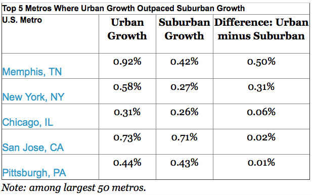
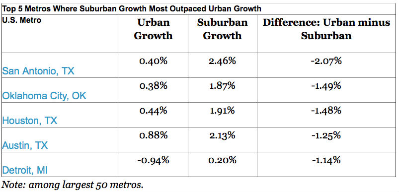
Looking more closely: what happened to growth in not just in the “more urban” neighborhoods, but in the MOST urban? Within each metro, we split neighborhoods into ten categories, based on their density. The highest-density category covers just the “most urban” parts of big cities (much of Manhattan, for instance, but none of Brooklyn) including a few neighborhoods that are technically outside the metro’s biggest city (parts of Cambridge MA, Arlington VA and Scottsdale AZ, for instance). On the other end of the spectrum, the lowest-density neighborhoods are the “most suburban” (in fact, in some metros, the lowest-density neighborhoods feel downright rural). Now the pattern gets interesting:
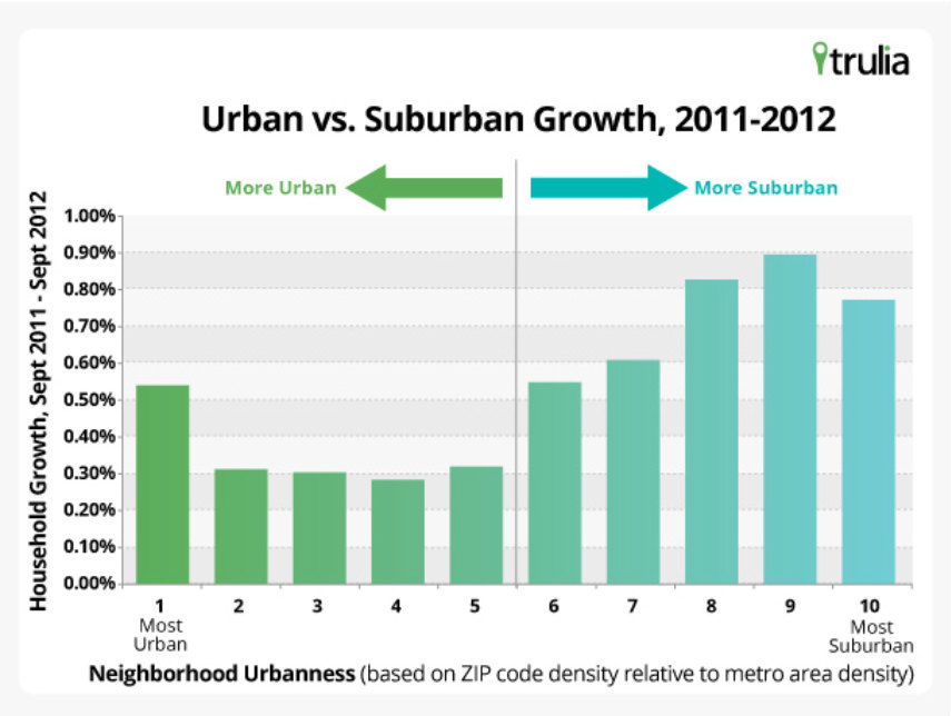
In general, the “more suburban” neighborhoods grew faster than the “more urban” neighborhoods. But the “most urban” neighborhoods actually had solid growth, as the leftmost bar in the graph shows. Household growth was 0.54% in these “most urban” neighborhoods,” which matched the overall growth rate for the metro areas examined. Furthermore, among only the largest 10 metros, household growth was 0.65% in the “most urban” neighborhoods, compared with 0.48% growth in these metros overall.
That’s the punchline: America’s suburban areas are continuing to grow faster than America’s urban areas. Despite falling homeownership, rising gas prices, downsizing baby boomers and improvements to city living, American suburbanization hasn’t reversed. Even though the highest-density neighborhoods, particularly in the largest metros, have grown in the past year, the suburbanization of America marches on.
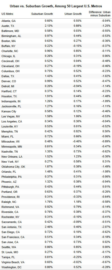
We’ve provided the full data set of urban and suburban growth in the 50 largest U.S. metro areas below.
The fine print:
- This Brookings analysis showed cities growing faster than their suburbs between 2010 and 2011, based on 2011 Census estimates. Posts at newgeography.com here and herecriticized the 2011 Census estimates and questioned research based on those estimates, including the Brookings analysis. The problem with the 2011 Census estimates is that the 2010-2011 growth rates for subcounty areas – which includes most cities and suburbs — were assumed to be the same as the growth rate for the whole county (with the exception of population in “group quarters”).
- We used the largest 50 metro areas. In this report, the “San Francisco” metro area includes Oakland; “Dallas” includes Fort Worth; “Washington DC” includes the Bethesda metro division; “New York” includes Long Island; and so on. (Most Trulia Trends posts use the smaller “metropolitan division” where they exist for consistency with other housing data reports.)
- The U.S. Postal Service reports delivery statistics by ZIP codes. We calculated density using 2010 Census data for ZCTA’s, a Census approximation of ZIP codes.
Jed Kolko is Trulia’s Chief Economist, leading the company’s housing research and providing insight on market trends and public policy to major media outlets including TIME magazine, CNN, and numerous others. Read more of his work at Trulia Trends blog.
This piece originally appeared at the Trulia blog.
